form.eh
A screen that contains a list of components. More...
Constants
Types
Functions
def CheckItem.get_checked(): Bool;
def CheckItem.get_text(): String;
def CheckItem.new(label: String, text: String, checked: Bool): CheckItem;
def CheckItem.set_checked(checked: Bool);
def CheckItem.set_text(text: String);
def DateItem.get_date(): Long;
def DateItem.new(label: String, mode: Int = DATE_ONLY): DateItem;
def DateItem.set_date(date: Long);
def EditItem.get_caret(): Int;
def EditItem.get_maxsize(): Int;
def EditItem.get_size(): Int;
def EditItem.get_text(): String;
def EditItem.new(label: String, text: String = "", mode: Int = EDIT_ANY, maxsize: Int = 50): EditItem;
def EditItem.set_maxsize(size: Int);
def EditItem.set_text(text: String);
def Form.add(item: Item);
def Form.clear();
def Form.get(at: Int): Item;
def Form.insert(at: Int, item: Item);
def Form.new(): Form;
def Form.remove(at: Int);
def Form.set(at: Int, item: Item);
def Form.size(): Int;
def GaugeItem.get_maxvalue(): Int;
def GaugeItem.get_value(): Int;
def GaugeItem.new(label: String, max: Int, init: Int): GaugeItem;
def GaugeItem.set_maxvalue(val: Int);
def GaugeItem.set_value(val: Int);
def HyperimageItem.new(label: String, img: Image): ImageItem;
def HyperlinkItem.new(label: String, text: String);
def ImageItem.get_alttext(): String;
def ImageItem.get_image(): Image;
def ImageItem.new(label: String, img: Image): ImageItem;
def ImageItem.set_alttext(text: String);
def ImageItem.set_image(img: Image);
def Item.get_label(): String;
def Item.set_label(label: String);
def PopupItem.new(label: String, strings: [String]): PopupItem;
def RadioItem.add(str: String);
def RadioItem.clear();
def RadioItem.delete(at: Int);
def RadioItem.get(at: Int): String;
def RadioItem.get_index(): Int;
def RadioItem.insert(at: Int, str: String);
def RadioItem.len(): Int;
def RadioItem.new(label: String, strings: [String]): RadioItem;
def RadioItem.set(at: Int, str: String);
def RadioItem.set_index(index: Int);
def TextItem.get_font(): Int;
def TextItem.get_text(): String;
def TextItem.new(label: String, text: String): TextItem;
def TextItem.set_font(font: Int);
def TextItem.set_text(text: String);
|
Description
A form is a screen that contains a list of interactive components called
Items. Items are arranged vertically - one item per line.
Every item can have a text label assigned to it. Label appears before or above
an item and visually differs from contents of the item. Item label may be
received or set by functions Item.get_label and Item.set_label
respectively. You may specify empty string as label to create item without label.
When the state of the item is changed by the user, form generates EV_ITEMSTATE
event.
Text item
Text item is non-interactive item that just displays plain text. Text may
contain line breaks (
'\n' characters) in which case it spans several
rows. Text also will be wrapped if it doesn't fit in a single line.
Constructor: new TextItem(label, text)
Properties:
-
text - text displayed by this item;
-
font - font to display the text with. On how to define a font, see font.eh.
Hyperlink item
Text item which contains hyperlink. This item inherits all properties from text item, but
it can be activated, e.g. by setting focus on it and pressing softkey or clicking it on
touch screen. When item is activated
EV_ITEM event is generated.
Constructor: new HyperlinkItem(label, text)
Image item
Image item is used to display an image.
Constructor: new ImageItem(label, image)
Properties:
-
image - displayed image;
-
alttext - a string to be shown in place of the image if the image exceeds
the capacity of the display.
Hyperimage item
Hyperimage is a hyperlink image. This item inherits all properties from image item, but
it can be activated, e.g. by setting focus on it and pressing softkey or clicking it on
touch screen. When item is activated
EV_ITEM event is generated.
Constructor: new HyperimageItem(label, image)
Edit item
Edit item is an editable text field in which user can input arbitrary text.
Edit item has a maximum size which limits number of characters that may be
entered in it. With specifying input mode actual input may be restricted to
accept only numeric input/e-mail addresses, etc... and/or hide input characters
(e.g. when entering a password). Constants to use as
mode argument may
be found in
ui_edit.eh.
Constructor: new EditItem(label, text, mode, size)
Properties:
-
text - text currently contained within this item;
-
maxsize - maximum number of characters this item can store;
-
size (read only) - number of characters currently stored in this item;
-
caret (read only) - current cursor position.
Gauge item
Gauge is a graphical item usually represented by horizontal bar or bar graph.
It contains integer value between 0 and
maxvalue which user can change
using left/right buttons.

Constructor: new GaugeItem(label, max, init)
Properties:
-
value - current value of the gauge;
-
maxvalue - maximum value of the gauge.
Date item
Item for presenting and choosing date and time. Date is represented by
Long number of milliseconds since "the epoch". Functions to work
with dates may be found in time.eh.
Constructor: new DateItem(label, mode)
Properties:
-
date - date currently stored in this item.
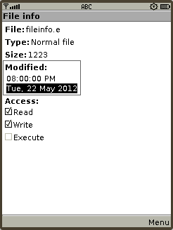
Check item
An item which have two states - checked and unchecked. Usually represented as
square box which is either empty or contains a tick mark or X.
Constructor: new CheckItem(label, text, checked)
Properties:
-
checked - whether this item checked or not;
-
text - text that follows check box. Do not be confused with label
which precedes an item. In the screenshot above all three checkboxes have text
assigned to them, but only the first is labeled.
Radio item
This item represents a list of strings only one of which can be selected at a time.
Selection usually visualized via "radio buttons" preceding strings.
Constructor: new RadioItem(label, strings)
Properties:
-
index - index of selected element, starting with 0.
Popup item
The compact version of radio item. Selected string is shown, all others are hidden.
When user chooses this item, popup menu appears, allowing to choose one of strings.
Constructor: new PopupItem(label, strings)
Properties:
-
index - index of selected element, starting with 0.
Constant details
Input mode for date item that allows to input only date.
Input mode for date item that allows to input only time.
Input mode for date item that allows to input both date and time.
Type details
A screen that contains a list of interactive components.
A component of the form.
An item that displays plain text.
An interactive text item, activating which generates an event.
An item that displays image.
An interactive image item, activating which generates an event.
An item in which user can input arbitrary text.
A graphical gauge display.
An item that allows to choose date and time.
An item that can be checked and unchecked.
A list of strings only one of which can be selected at a time.
A list of strings that uses popup menu.
Function details
Creates new empty form.
Returns label assigned to this item.
def Item.set_label(label: String);
|
Sets new label to this item.
If argument is
null then item has no label.
def Form.add(item: Item);
|
Adds new item to the end of this form.
Returns item in the specified row of this form.
Sets new item in the specified row of this form replacing previous item.
def Form.insert(at: Int, item: Item);
|
Inserts new item in the specified row of this form moving all subsequent items lower.
def Form.remove(at: Int);
|
Removes item in the specified row of this form.
Returns current number of items in this form.
Removes all items from this form.
Creates new item that shows given text.
def TextItem.get_text(): String;
|
Returns text contained in this text item.
def TextItem.set_text(text: String);
|
Sets new text to this text item.
def TextItem.get_font(): Int;
|
Returns font used in this text item.
def TextItem.set_font(font: Int);
|
Sets font for this text item to display text with.
Creates new hyperlink item with specified label and text.
Creates new image item.
def ImageItem.get_image(): Image;
|
Returns image contained in this item.
def ImageItem.set_image(img: Image);
|
Sets new image to this item.
def ImageItem.get_alttext(): String;
|
Gets the text string to be used if the image exceeds the device's capacity to display it.
def ImageItem.set_alttext(text: String);
|
Sets the alternate text of the ImageItem.
If
null no alternate text is provided.
Creates new hyperimage item with specified label and image.
Creates new editable text item.
Argument
mode must be one of
EDIT_* constants from
ui_edit.eh.
Argument
maxsize specifies maximum length of string that user can input in
this item. Note that actual maximum size may be even less than this argument due to
platform limitations. To get actual maximum size use
get_maxsize.
def EditItem.get_text(): String;
|
Returns text currently stored in the editable item.
def EditItem.set_text(text: String);
|
Sets new text to this edit item.
def EditItem.get_maxsize(): Int;
|
Returns maximum length of text this item can store.
def EditItem.set_maxsize(size: Int);
|
Sets new maximum length of text this item can store.
def EditItem.get_size(): Int;
|
Returns number of characters this item currently stores.
def EditItem.get_caret(): Int;
|
Returns current input position.
On most devices this function simply returns cursor position.
On some devices, however, it blocks and asks the user to set position.
Creates new gauge item.
Gauge item represents
Int value between zero and
max value
and initially set to
init. User can decrease or increase this value
by pressing left and right buttons respectively.
def GaugeItem.get_value(): Int;
|
Returns current value of the gauge item.
def GaugeItem.set_value(val: Int);
|
Sets new value to the gauge item.
def GaugeItem.get_maxvalue(): Int;
|
Returns maximum value of the gauge item.
def GaugeItem.set_maxvalue(val: Int);
|
Sets new maximum value to the gauge item.
Creates new item that allows to input date or/and time.
Argument
mode must be one of constants
DATE_ONLY,
TIME_ONLY or
DATE_TIME. Date item initially have
no date set.
def DateItem.get_date(): Long;
|
Returns date currently set in this date item.
If date is not set then
null is returned.
def DateItem.set_date(date: Long);
|
Sets new date to this date item.
Creates new item that has one of two states - checked or unchecked.
def CheckItem.get_checked(): Bool;
|
Tests whether this check item is checked.
def CheckItem.set_checked(checked: Bool);
|
Checks or unchecks this check item.
def CheckItem.get_text(): String;
|
Returns text of this check item.
def CheckItem.set_text(text: String);
|
Sets new text to this check item.
Creates new item where user can pick one from the list of choices.
Array argument must contain only
String values, these values are used
as choices in this item. You may use zero length array (
[]), if you want
to fill this item with strings later.
def RadioItem.get_index(): Int;
|
Returns index of selected string in this item.
def RadioItem.set_index(index: Int);
|
Selects new choice in this item.
def RadioItem.add(str: String);
|
Appends new string to the end of list.
Inserts new string in the specified position of this item.
Replaces string in the specified position of this item.
def RadioItem.delete(at: Int);
|
Removes string in the specified position of this item.
Returns string in the specified position of this item.
Removes all strings from this item.
def RadioItem.len(): Int;
|
Returns current number of strings in this item.
Creates new popup item with specified list of strings.